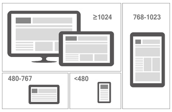
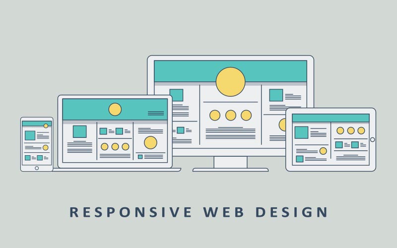
In the last few years, the number of mobile users and devices has grown exponentially. As a result of this, providing a seamless, high-quality user experience on desktop, tablet, and mobile is more important than ever. Responsive Web Design (RWD) is arguably one of the best ways to tackle the issues that arise when designing for multiple devices.
BDM Infotech defines RWD as “an approach to web design aimed at crafting sites to provide an optimal viewing experience - easy reading and navigation with a minimum of resizing, panning, and scrolling - across a wide range of devices.”
Responsive web design (RWD) is a setup where the server always sends the same HTML code to all devices and CSS is used to alter the rendering of the page on the device. Google’s algorithms should be able to automatically detect this setup if all Googlebot user agents are allowed to crawl the page and its assets (CSS, JavaScript, and images).


We love data, and spend a lot of time monitoring the analytics on our websites. Any web developer doing the same will have noticed the increase in traffic from mobile devices of late. Over the past year we’ve seen many key sites garner a significant percentage of page views from Smartphone’s and tablets. These represent large numbers of visitors, with sophisticated browsers which support the latest HTML, CSS, and JavaScript, but which also have limited screen space with widths as narrow as 320 pixels.
Our commitment to accessibility means we strive to provide a good browsing experience for all our users. We faced a stark choice between creating mobile specific websites, or adapting existing sites and new launches to render well on both desktop and mobile. Creating two sites would allow us to better target specific hardware, but maintaining a single shared site preserves a canonical URL, avoiding any complicated redirects, and simplifies the sharing of web addresses.
-
Google Loves It
Google recommends using Responsive Web Design, as it adheres completely to their recommended configuration for creating mobile-optimized websites: device-optimized content, clean link structure, and better user experience.
-
Search Engine Friendly
A responsive website runs on a single URL, which minimizes the chances of on-page SEO errors and makes it easier for search engine spiders to crawl your site.
-
Easier to manage
A responsive site with a single URL is far easier to manage than a non-responsive site that has separate mobile and desktop URLs. If your site is responsive, you just need to update a single set of site files.
-
Enhanced User Experience
A responsive website adapts to any device and screen size, offering your visitors a seamless and optimal experience that results into ranking your website higher in Google.
benefits of responsive wedsites
-
Cost and Time Effective
A responsive website has a single version of the source code that works on all devices. So managing a responsive website requires less maintenance cost and administration time as compared to a non-responsive one.
-
Lesser Bounce Rate
A responsively designed site doesn’t require your users to pinch to zoom or scroll around to find what they’re looking for. This keeps them longer on your website’s pages, which results into decreased bounce rate.
-
Boost Up Sales and Conversion
Having mobile specific features and easily readable content, a responsive website helps you expand your audience, which results into higher conversion rate and increased sales.
-
Future Proof
Responsive web design is 100% future-proof, means it will continue to look amazing and beautiful in future devices such as watches, TVs, glasses etc. You just need to update your content, instead of building a new website yearly.

